I needed a symbol. I wanted something unlike any other company logo so that we would stand apart from other companies. Basically, I liked the reticle that the alien Predator used. More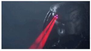 specifically, I liked the angular look, so I had to sketch about half a dozen designs.
I placed the Emerson Knives, Inc. and USA in the center line intersecting the chevrons. That's how our logo came to be. – Ernest Emerson
THE EMERSON LOGO ORIGIN
The Emerson Logo was born in a funny way. On my living room floor after watching the movie “Predator“, starring Arnold Schwarzenegger. I was interested in creating a logo other than just a name and fancy lettering. Instead, I wanted
 something unique in shape that would be easily recognized even if you could not read the name from a distance.
 I settled on the classic chevron design with a vertical line down the center for two reasons. Like I said, I liked the reticle look but its design also draws you into the center point. This makes it almost like the white line down the middle of a highway. It has a vanishing point effect with the chevrons flowing away from you. It represents traveling towards a destination- the future.


I loved that logo and was sad when it changed. Im sure many people like myself yearned for the old one for years, and now that we can finally afford them they look different unfortunately. Knifers are a nostalgic consumer no doubt. Any story on the new logo and why the change was made?