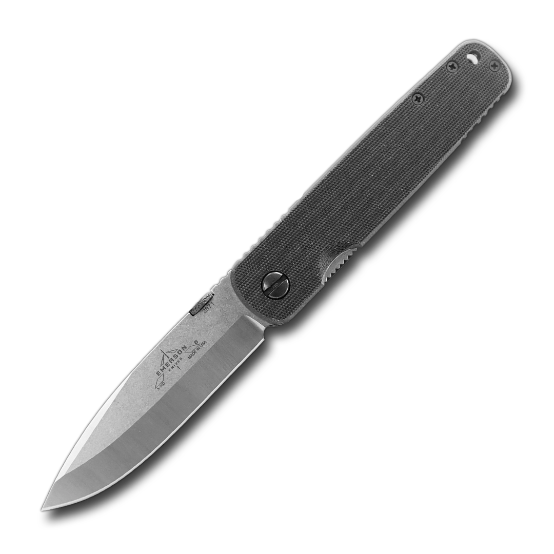
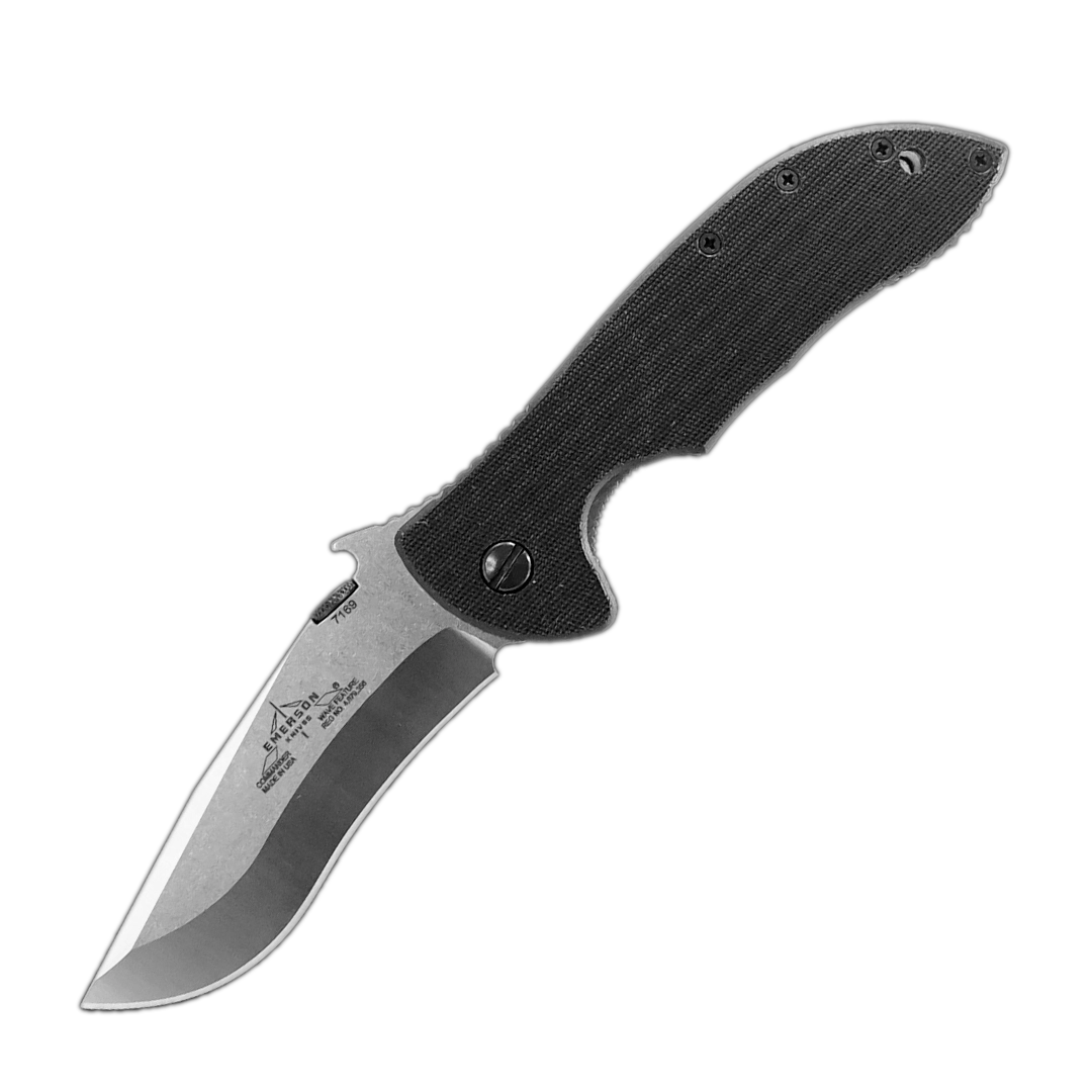
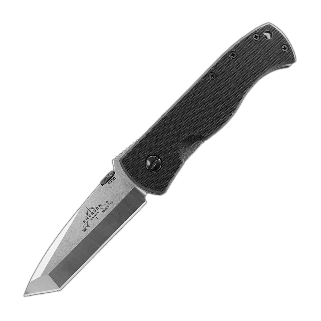
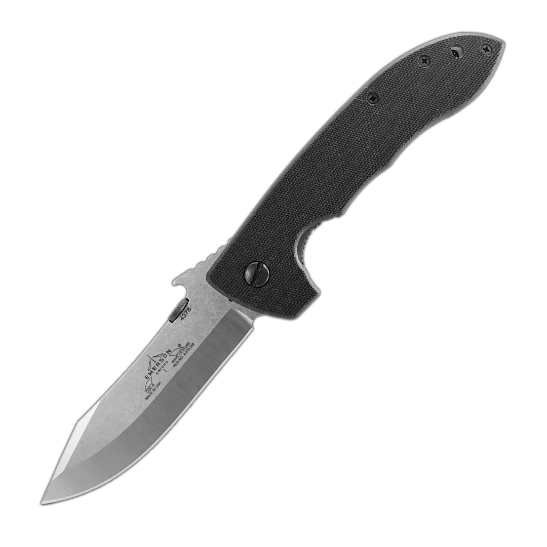
The Emerson Logo was born in a funny way. On my living room floor after watching the movie “Predator“, starring Arnold Schwarzenegger. I was interested in creating a logo other than just a name and fancy lettering. Instead, I wanted something unique in shape that would be easily recognized even if you could not read the name from a distance.
I needed a symbol. I wanted something unlike any other company logo so that we would stand apart from other companies. Basically, I liked the reticle that the alien Predator used. More specifically, I liked the angular look, so I had to sketch about half a dozen designs.
I settled on the classic chevron design with a vertical line down the center for two reasons. Like I said, I liked the reticle look but its design also draws you into the center point. This makes it almost like the white line down the middle of a highway. It has a vanishing point effect with the chevrons flowing away from you. It represents traveling towards a destination- the future.
I placed the Emerson Knives, Inc. and USA in the center line intersecting the chevrons. That's how our logo came to be.
- Ernest Emerson


