New Logo | Same Outlook
“Emerson Knives is moving in a new direction with our new logo. This couldn't have happened without the hard work and dedication of my family and my loyal employees but mostly thanks to our loyal fans. This dedication continues to evolve, and we are excited to share our new logo with you! As I'm sure some you have noticed, you will be begin to see some updated pictures, email blasts, and new content very soon. We want to thank you for your continued support and loyalty of the Emerson Brand. I hope you enjoy the refreshed look of Emerson.”
The Emerson Logo Origin


The Emerson Logo was born in a funny way. On my living room floor after watching the movie “Predator“, starring Arnold Schwarzenegger. I was interested in creating a logo other than just a name and fancy lettering. Instead, I wanted something unique in shape that would be easily recognized even if you could not read the name from a distance.
I needed a symbol.
I wanted something unlike any other company logo so that we would stand apart from other companies. Basically, I liked the reticle that the alien Predator used. More specifically, I liked the angular look, so I had to sketch about half a dozen designs.
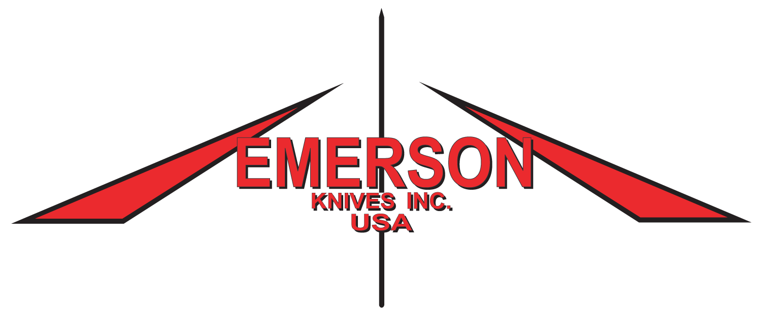
I settled on the classic chevron design with a vertical line down the center for two reasons. Like I said, I liked the reticle look but its design also draws you into the center point. This makes it almost like the white line down the middle of a highway. It has a vanishing point effect with the chevrons flowing away from you. It represents traveling towards a destination- the future.
I placed the Emerson Knives, Inc. and USA in the center line intersecting the chevrons. That's how our logo came to be.
– Ernest Emerson

